News, tips, tricks and discussions related to web strategy, web design, and custom web application and database development.
Viewing posts for topic: "CSS". View all posts.
In November 2012, Modern Signal launched a redesign of our site. We were (are!) very proud of how it looked and the ways it would allow us to keep future and current clients better informed. One problem: it wasn't responsive. Our redesign had been in the works for a while, and the design had been approved and finalized before we became fully aware of a new reality: because of the proliferation of smartphones and tablets, modern websites must adjust to a wide variety of screen sizes. They must be responsive.

The problem was that we had just invested considerable time and energy in redesigning our site. We were happy with the way it looked on desktop browsers, and we didn't want to start over. The question arose, can we keep our design and just make it responsive? This same question has started to come up with many of our clients too, and so it was definitely worth investigating.
If you ask a designer whether you need to start from scratch to make your site responsive, they are likely to say, more or less, yes. That is, you may be able to keep much of the overall look and feel of your site, but you'll have to rethink so many things you are better off starting over. I'm not a designer, though. I'm a developer with years of experience in the trenches with html, css, and javascript. And so in my usual naivete I thought, "How hard could it be?"
"How Hard Could It Be?"
The answer to this question is, of course, "It depends." The designers are right in that you have to rethink many of the visual elements of your site in order to make it responsive. You likely have a top navigation bar with drop-down menus. You likely have a side navigation bar which will not fit on smaller screens. You may have some fixed-width background images that are not going to expand and contract the way they need to in a responsive site. The Modern Signal site had all of those things.
In the end, though, all of these challenges were surmountable with css, elbow grease, and just a little bit of targeted redesign. I'll take you through how we tackled these challenges.
"What Needs to Change?"
The first step in making any existing design responsive is to walk through the site to identify things that have to change. Mainly you are looking for:
There are other less well-defined things you might want to consider, like how much content people will comfortably scroll through on a phone, but these are the biggest red flags. In our site this list brought up:
So, knowing what I needed to attack, I dove in.
BootStrap - Laying the Groundwork
First things first. We had become familiar with Twitter's Bootstrap framework. We like it for its attractive set of widgets as well as it's framework for building responsive sites. The first step, then, was to integrate the Bootstrap CSS files and change the html of the site to use the Bootstrap concepts of "rows" and "spans". I won't delve into this too much as I doubt there is much I can add to the information already available.
"How to Go from Fixed-width to Expandable?"
Our right navigation presented an immediate problem: it used fixed-width background images in order to give it a distinctive banner look and feel:
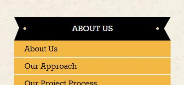
The html and css looked very like this (only including relevant css):
html:
<h3 class="subnav-section">
<a href="/aboutus">About Us</a>
</h3>
css:
.subnav .subnav-section a {
background: url('../images/subnav-section-bkg.png') 0 0 no-repeat;
}
This is simple, effective and ... not responsive. In the end, I ended up coming to terms with an ugly fact: I couldn't fix this with css alone. At least not with the css available to me (maybe I can ignore IE6, maybe even IE7, but not IE8!) I would have to add a little html to make it work. What I ended up with was:
html:
<div class="banner-header">
<h3>
<a href="/about_us">About Us</a>
</h3>
</div>
css:
.banner-header {
background: url('../images/banner-bkg-left.png') left 0 no-repeat;
padding-left: 30px;
}
.banner-header h3 {
background: url('../images/banner-bkg-right.png') right 0 no-repeat;
padding-right: 30px;
}
I added an extra div tag around the header. The background of the div tag is the left side of the banner, while the background of the h3 tag is the right side of the banner. The middle of the banner is, mercifully, just a plain black background and can expand to its heart's content. This worked well, and only forced me to add one html tag.
On to the next challenge...
"How to Unclutter the Top Navigation?"
Our top navigation is a relatively simple line of links with drop-down menus that appear when you hover over the links. They wrap fine, but get pretty jumbled on small, phone-size screens. They also use hover actions to display submenus, which doesn't work on devices that use touch screens.
Here is a case where simply rearranging the existing design elements didn't work. We needed to rethink the design a bit. The default Bootstrap template deals with this by transforming the navigation into a single button that displays a drop-down of the entire menu when clicked. We ended up using the same idea:
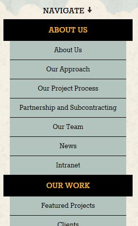
What's important to note about this is that we didn't need to rethink the design of our entire page to accomplish this -- we just had to rethink this one element.
"What About the Carousel?"
Our next challenge was dealing with the carousel on our home page. Large home page carousels are very popular on websites nowadays. They're splashy and can be used to draw the visitor's attention to news, products, featured services, etc. They usually, however, take up the full width of the page and so present a problem for responsive design.
So, it's a common problem, which is fortunate. I quickly found Flexslider, which handled most of the responsive challenges for me. It took very little time for me to replace our current carousel code with Flexslider.
We still had a problem, though. The items in our carousel contain images and text. We can make the images progressively smaller, but at some point we just don't have enough room to make the text fit over the images without making the text too small to see. The answer for us was to hide things progressively as the page width gets smaller. This is very easy to do using some built-in Bootstrap classes. If you want something to be hidden on tablet-sized devices or smaller, use the "hidden-tablet" class:
<div class="hidden-table">...</div>
If you want something to be hidden on phone-sized devices or smaller, use the "hidden-tablet" class:
<div class="hidden-phone">...</div>
Using these classes, we hide the descriptive text in the carousal on devices smaller than 1024px wide, and we hide the carousel altogether on devices smaller than 768px. So go from:

on large devices to:

on medium-sized devices to:

on very small devices.
Conclusions
In the end, we're very happy with the results of the responsive web design overhaul of our site. We got it done much faster and cheaper than we would have had we gone back to the design phase. Of course, if we had been in the market for a full redesign anyway, we would have done that, but we were happy with our design and just wanted to add some responsive sugar to it, to in effect make it a mobile website and a tablet website as well as one that looks good on the desktop. We have heard from a lot of people who are in the same boat, and I hope this post gives heart to those who would like a responsive site but are not ready for a redesign.
Interested in implementing responsive elements on your own site? Download this checklist of things you should keep in mind.
Comments (0) Posted on February 25, 2013 12:19:48 PM EST by Emily Guyton
I recently finished a redesign project, and there were some interesting challenges that came up that I thought I would write about.
To start off, there were the menus. The site has an obligatory drop-down menu at the top, and a similarly styled menu on the left. Here's a look at the drop-down menu:
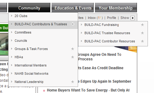
As you can see the items in the menu have a little caret on the left, they turn a darker gray on mouseover, and certain items (members-only ones) have a special star icon on the right. There are also submenus with the same style. I'm not going to talk about the specific javascript implementation that I used for the drop-down (I used a slightly modified version of the jQuery plugin jdMenu to get it done -- http://jdsharp.us/jQuery/plugins/jdMenu/), but will instead address how the styles are implemented, which was a bit trickier than you might think.
The html for the menu is a simple nested unordered list:
<ul>
<li><a href=[url]>20 Clubs</a></li>
<li><a href=[url] class=star>Build-PAC Contributors</a>
<ul>
<li><a href=[url] class=star>BUILD-PAC Fundraising</a></li>
... etc ...
</ul>
</li>
... etc ...
</ul>
Nice and clean and accessible. But the style has to be pixel perfect too, of course.
When I got the menu from the designer, the caret and the star were implemented with a single background image. That made sense to some extent. You can only have one background image per element. And I can't use the <li> for one of the background images because the only elements that supports the hover is the <a> tag. And I needed to use the a:hover css selector to make the items turn dark gray on mouseover.
Fine. But that really makes things a bit complicated and inflexible. What if I need to adjust the width of the menus (which did indeed happen several times during the redesign)? I would then need to recreate those background images with the correct width. I know just enough Photoshop to do that kind of thing, but it's really annoying.
Finally it occurred to me that there's really no reason that the <a> tag is the only one that can do a hover. With javascript, I could capture the hover for any element. What is more, jQuery made this very easy to do. I added this to my page:
$("td.leftnav ul li").hover(function(){
$(this).addClass("hover")
},function(){
$(this).removeClass("hover")
})
(Okay that bit of code applied to my left navigation menu. jdMenu actually took care of this for my top nav by adding a "jdm_hover" class.)
So with that little bit of code, I was free to set the caret as the background of the <li>, and set the star as the background of the <a>, and let the hover of the <li> take care of the background color change. And when I inevitably got that call to change the width of the menus, it was a simple change in the stylesheet.
Comments (0) Posted on September 22, 2009 3:08:41 PM EDT by David Hammond
Comments (0) Posted on April 29, 2008 12:02:31 PM EDT by Catherine Field
